Monday 31 October 2011

Reflection on shoot 26/10/11


To begin our filming for this term, and try out some methods/ideas for shots we had, we decided to have a film shoot during half term at the Southborough scout hut. After some deliberation, we decided to try out three of our trickiest shots - a smashing glass, our main character eating a sandwich filled with worms, and our studio lighting shots which we were able to achieve using the space that the scout hut gave us.
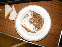

The first shot we tried was the 'worm sandwich' shot. We were able to purchase live mealworms from the pet shop a couple of minutes walk away, which made for nice closeup shots of the sandwich we created. In order to shoot Harri eating it, we made a bitemark shape around which we made sure there were no worms, then shot him pretending to eat the sandwich. Overall, the close-ups of the sandwich looked brilliant, but the shot of him eating it was under-lit - we might try it again, if Harri's up for it. We did attempt some other shots with the worms, where we let one wriggle around on Harri's face and then shot a close-up. This also worked well, and we plan to use it and the others in our final edit.

As well as this, we attempted to shoot our 'pouring vodka' shot, in which the character's alter-ego takes a bottle of vodka (water for the purposes of the shoot) and tips it in progressively increasing quantities over his face and body, to be juxtaposed with him quietly and subduedly drinking a cup of tea (or otherwise). This went extremely well in my opinion, as Harri acted the part convincingly and was able to achieve exactly the look we were going for.

All the shots we tried with different lighting haven't been reviewed yet, but we are confident that they will look good.

The final shot we tried, and the one that didn't go as well, was the 'smashing glass' shot. The problem was that the camera we were using did not have a fast enough framerate to capture the glass's fall. We ended up with about one frame of  a blurred object and then the smash at the end. We may have to reconsider this shot, or else find a way of filming it with different equipment. 

Overall, we had a good day's worth of filming, only ended because of the poor weather stopping us from completing our outdoor shots. Everything we achieved on that day will help us to continue to work on our project, and inform us toward future shoots.

Wednesday 26 October 2011

Group: Animatic

This week, we've commenced work on our storyboard which we will eventually turn into an animatic. At present, and in order to denote the different narratives, we've decided to use three colours of paper - blue paper for one line of action, yellow for the other, and white paper for anything neutral and out-of-narrative, i.e. band shots. We're currently cutting each frame into separate squares to allow us to chop and change where we see fit. When we decide on the order, the storyboard will be stuck down onto a large sheet of paper. 

We're aiming to get all the drawing done by the middle of next week.

Friday 21 October 2011

Group: Risk Assessment and Call Sheet

Here is the risk assessment and call sheet for the shoot we are planning to do on Wednesday 26th October. We have changed the original plan of meeting on Tuesday and Friday, and have decided to just meet on Wednesday and shoot everything then, as it is easier for those involved.

We will meet in Southborough at 12:00, and start shooting indoors in a 'studio' that we will build, before filming the cafe shot and walking shots in Southborough afterwards.


Wednesday 19 October 2011

Group : Reflecting On Idea

Today we set about storyboarding our music video, and began to run into problems when we realised that, as a group, we were unsure of the specific action that takes place in the music video. Although we are all happy with the overall concept of a split narrative and the idea of a character making a decision, we are all unsure of what specific shots and locations we should include.

Following a discussion with Mrs Fernandez, we are now exploring the possibility of having a less literal, continuity edited video, and having more narrative fuzz, where objects are used to represent the choice. This could include the character breaking the forth wall and using mise-en-scene to explore the two narratives.

As a group, we have not yet made a final decision on what our video should be like and include.

Group : One Line Explanation

The short explanation of our video is as follows :

"A split narrative, following two lines of action which show the possible consequences of taking a decision, one to face up to responsibility, the other to run away from it. The video is ambiguous, and the audience can decide which decision the main character 'chooses' ".

Monday 17 October 2011

Group: Pitch - Feedback & Response

Here is the Prezi which we completed for our pitch, which we presented on Friday 14th October.


We have been given the green-light, so plan to start shooting soon, hopefully shooting some footage in October half term.

The feedback from the pitch was that although the idea was strong, it was very ambitious and we would need to plan and storyboard the idea very carefully. Storyboarding and creating the animatic is the next stage in planning our video. In our storyboard, we will draw the shots on two different paper colours, to distinguish between the two narratives.

We had to explain the concept a couple of times in the pitch, which showed us that our idea is quite complicated. Although the idea of our video is to have narrative fuzz and not explicitly show the audience exactly what is happening, we want the audience to be able to work out the music video, so need to be careful when making the video to not have it too complicated.

Sunday 16 October 2011

Group: Audience Research (concept)

We have tested our concept for the music video 'Eat That Up, It's Good For You' with our potential audience, in two ways, to gain insight into how our potential audience would react to the music video that we have in mind for this track.


Method 1 : Survey Monkey


Our first method was use of the online surveying tool, 'Survey Monkey', which allows us to write a number of questions and then give the questions out to a larger group of people and collect the results. When we carried out of research on Survey Monkey, we were still in the early stages of the creative process, so were testing a number of ideas to see which direction our music video should take. 


Here are some of the questions we asked. Other questions included 'warm up questions', such as their age, favourite music genre and how much they liked the song. These questions are more useful, as they have given us insight into the music video that the audience would expect when seeing a music video for this song. 


When asked about the sort of images that people associate with this song, the most common words included 'sun', 'outside' and 'energy/upbeat'. This reflected our initial ideas for the video as we wanted a happy, bright feel to the music video. However, the sunshine could be an issue, as we will be filming our music video in the autumn and winter months, so are not able to guarantee sunny weather. However, we can still give our video an upbeat, happy feel to it. 


We also felt that an element of humour was important in a music video. However, our audience research showed us that people felt that aspect was far less important than others. This has influenced our creative process, as we now are putting less emphasis on making the music video humorous, and although we may keep a funny aspect to the video, it won't be the most important factor. 


Another of the important questions that we asked was where our potential audience felt that the video should be set. Here, our potential audience agreed with our instinct, that the video should have a sub-urban feel to it. We have therefore decided to film all of the exterior locations in Maidstone, which gives us a lot of scope in terms of filming locations, and also has a distinctly sub-urban feel to it.


Method 2 : Focus Group


Our second method for collecting audience research, and actually testing our concept in more details was through the use of a focus group. Our methodology in this method of audience research was to give the four people that we questioned on our concept options of how they rate the concept initially, and then discuss in detail how they envisaged the music video looking. We gave each member a list of the questions, so that they could write their thoughts whilst we discussed them.


We started the focus group by having everybody listen to the track all the way through, and then give everybody a moment to consider their opinion of the track and what their initial thoughts for a music video were (we asked what they thought, and there were no suggestions early on for what they thought the music video should look like, apart from results which were similar to that of our Survey Monkey research, with responses like 'upbeat').


We then gave each member of our focus group the following treatment :


"A split narrative, following two lines of action which show the possible consequences of taking a decision, one to face up to responsibility, the other to run away from it. The video is ambiguous, and the audience can decide which decision the main character 'chooses'". 


Our focus group responded well to our concept, feeling that a split narrative was a strong concept, and that it would be more memorable as a music video, as well as standing up to repeatability, which was a very important factor to us. We were pleased that members of the focus group, who are the sort of people who would actually view the music video liked our concept and felt that it would work. 


We also asked what they believed our main challenges with this concept would be.  The group all agreed that our main challenge would be in maintaining two narratives clearly, but not too obviously. We have since discussed this as a group, and have agreed that it is a fine balance, between making it subtle enough that we are not giving it away too much to the audience, but at the same time we need our audience to be able to work out what the music video is about. 


Our other important question was whether the music video we have envisaged fits in the track. We wanted to discuss this with the focus group, as we were concerned that our new ideas wasn't particularly based on the track. However, our our focus group felt that the concept fits the track well, although one person (see questions above) was not sure about the idea of pregnancy being the cause of the decision.


In conclusion, we are pleased with the audience research, as in the most part it is confirmed our instincts about the video that we are creating, but has also shaped our direction, for instance not focusing too heavily on humour. We will use the audience research we have worked on the develop our concept further. 

Monday 10 October 2011

Group: Latest Music Video Ideas

We have decided to continue with the idea of two lines of action, representing two versions of the same character, the lead singer from the band, but we have developed our ideas further.

We plan to have the two lines of action not immediately obvious, but they become increasingly obvious as the song goes on. The colours will become more distinctive, with one line of action the colours being brighter and the mood happier, whilst the other line of action will have decreasingly dull colours and sadder mood.

The video will end with the revelation that the two lines of action come down to a choice, which was made before the music video began, and the audience has seen the two possibly consequences of the decision that the character made. For instance, he gets a party invite and the two lines of action explore both the possibility that he did go to the party, and he didn't.

The other idea we had is that throughout the video, an object is falling in extreme slow motion, and the very last shot of the video is the object smashing.

Deconstruction of digipak - Scouting For Girls

I have chosen to deconstruct the Scouting For Girls self ttitled first album, as the up and coming indie music style is similar to that of the Two Door Cinema Club song that we are basing our music video on.

Genre :
The genre of the music is made obvious through the use of the illusion of a textured cover, with what looks like rough paper, with printing of it. This gives the cover a low-fi feel, which connotes the concept of a new band which doesn't have much money and has a basic, 'stripped down' first album. The song title list on the back of the album maintains the font to keep a sense of brand continuity, and the text looks faded, again connoting a low-fi feel.

Media Language :
On the front of the album, rule of thirds is obvious, with an image of two people in a boat placed on the bottom right of the album cover. The style of the cover is designed to look like the album has a rough texture, with simple, faded colours used. The image appears fairly irrelevant to the album, perhaps chosen because of the associations with the band name 'Scouting For Girls', and the idea of outdoor activity.

The inside of the booklet which comes with the album is designed to look like a scrap book, with song lyrics written and typed as if they are the original scraps of paper that the song writers used to pen the song on. There are cut out images, again continuing with the theme of a scrap book, the theme of childhood and outdoors is prominent. There are hand drawn images, as well as traditional childhood images like the boys school pictures and images of the boys on scout camps.

These visual techniques generate meaning, with themes such as innocence and a future band being created. The media theorist Barthes wrote about media codes, and the digi-pak draws on the cultural code, with images of stretchy men and scout uniforms known to us through British culture. These images are used to start creating (it is the bands first album) a band meta-narrative, which is of orginal, indie British music which is not manufactured.

The main use of linguistics in the digi-pak are the song lyrics and titles, which are obviously full of emotive language which constructs the brand identity as an emotional, but good humoured band. Other words are used to fit in with the scrap book theme of a boy scout, such as a list of personal kit and notes about star formations and secret codes.

The only refernence to popular culture is the reference to Elvis Presley in the newspaper article and the song title 'Elvis Ain't Dead'. Humour is used, as the scrap book isn't real, and it is so idyllic that it is almost funny, with embarrassing pictures of the band members when they young used. This gives the digi-pak a post-modern theme, that the band are laughing at themselves to an extent, and although they take their music seriously, they also have good fun.

Institution and Audience :
The print text is likely to be consumed by a casual fan of the band, who has already bought the album. The album cover does not feature bright colours, so it would not particularly stand out in a shop, although the album was released in the digital age so it is likely to have had a large online promotion and marketing.


The back of the album contains the song list, and continues the theme of a natural album with natural colour and feel.

Sunday 9 October 2011

Cage the Elephant - Shake Me Down

Could be my new favourite video.
Check out the colour balance, the focusing and the movement of the shots, see if there's anything you'd like to use. I personally love the clean, slightly over-white tone of the outdoor shots, it suits the melancholy feel of the piece.


Wednesday 5 October 2011

Group: Response to digipak/advertisement brief

Our brief for creating an advertising campaign consists of designing a digipak and advert to run in a magazine or newspaper. We have discussed where our advertising campaign should run to reach its widest audience and have concluded that either a broadsheet newspaper like the Observer or an indie-style music magazine would be most appropriate.

We have looked at previous Two Door Cinema Club album covers/digipaks and although there is a clear sense of continuity through the album covers, we have decided to aim for our own style, which we believe befits the genre in a more aesthetic manner. However we shall use some aspects of the band's previous designs.

In terms of dividing the workload between us, Chris will design the digipak and Ben will design the poster. We plan to work together to create a sense of cohension through the advertising campaign, and use the same style and font throughout.