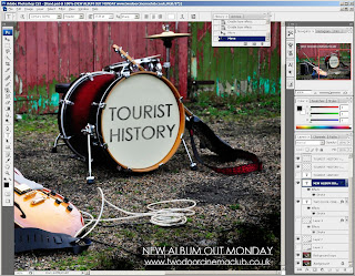
For my print work, I decided to do a magazine advert promoting a new album. I wanted to create a sense of
brand continuity across all of our
promotional material, so took the photograph at the same location as not only the band performance in the music video, but also the advert for the tour and the pictures used in the digi-pak. I didn't want any band members in the advert, so chose to take a picture of the band instruments left on the floor.
I wanted to write the album name 'Tourist History' on the drum kit, so the first stage of editing the advert was removing the drum brand 'TAMA' from the bass drum. To do this, I imported by still image to Photoshop Elements CS3, and selected the
clone stamp tool, which allowed me to clone the image of the drum near the text over the top of the text, effectively removing it.
I used a small brush size, which gave me more control over the image that I was editing and the effect I was using.
The next stage of the advert was to insert the main text, which is the band name 'Two Door Cinema Club'. I wanted this to be large text, in the top left corner so that it was
bold and stood out, as well as following the
traditional reading line. I used the text tool, and selected the
font Century Gothic which is the same font used on the other advert, the digipak, and also the font that the band use on their albums. Because the plain white font did not stand out enough, I added a thin, black line around the text using the
stroke tool, and then reduced the
opacity to make it look neater.
Following the reading line, the next text to write was the album name 'Tourist History'. I used the same font, but put the text in black, and distorted the text so that it looked like it was written on the text. Then, to make the text look less flat, I
duplicated the text layer, and on the first layer used brush to create a 'splash' effect on the text, and remove it, then by adding another text layer on top, I the text looked less flat and like it was actually written on the drum.
The next stage was to write the details of the new album in the bottom right corner. However, the white text I wanted to use did not stand out against the gravel floor, even with the stroke tool. To combat this, I used another brush, and made the brush size very large and used this tool to create a black, grainy splash effect in the bottom right corner. I chose this over just adding a block of black as it was more subtle and faded nicely into the gravel of the original picture.
This meant that I was then able to write the album details in the bottom corner, so I once again used the same font, Century Gothic, and added the text 'NEW ALBUM OUT MONDAY' in capitals, not only to make it stand out, but also to create a sense of importance and urgency. The text underneath, which was the band web address, was centred and made to a size where it could be
justified with the text above it, so that it looked square and neat, and didn't hang over the edge of the text.
The final stage of the advert was to insert an image of the digipak was to insert the album from cover, taken from Chris' completed digipak. I dragged the image into Photoshop, and used the image resize tool to make the cover the correct dimensions for the advert. I wanted this image just above the details of the new album, as this is where it is most relevant, and I also wanted it big enough to be able to see clearly, but not so big that it distracted from the rest of the image.
Below in the completed magazine advert for the album.


